Guides
How to Design a Custom Patch: Patch Design Rules That Work
By the Nation Patches team · Updated · 6 min read
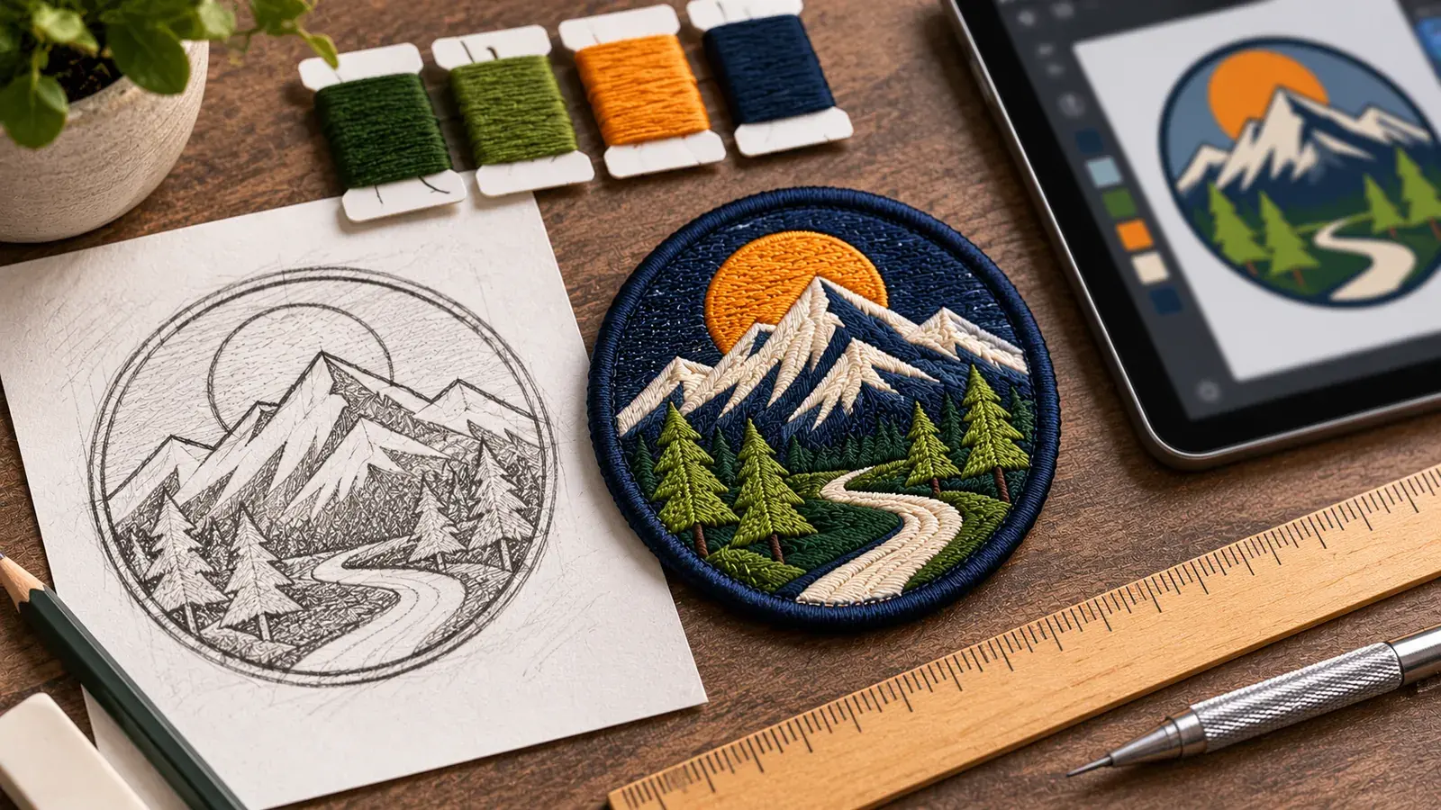
Good patch design comes down to bold shapes, few colors, readable text and artwork sized for the real patch. A design that looks great on a screen can turn muddy once it's stitched at 3 inches. That's why the best patches start simple and get tested at actual size.
This guide covers the rules that make designing a patch easier, from first ideas to the files you send. In addition, it explains how embroidery patch designs differ from PVC and woven designs.
Start Your Patch Design With a Clear Purpose
Before you sketch, answer three questions. Who will wear the patch? Where will it go? And what should people read or recognize first? Those answers shape everything else.
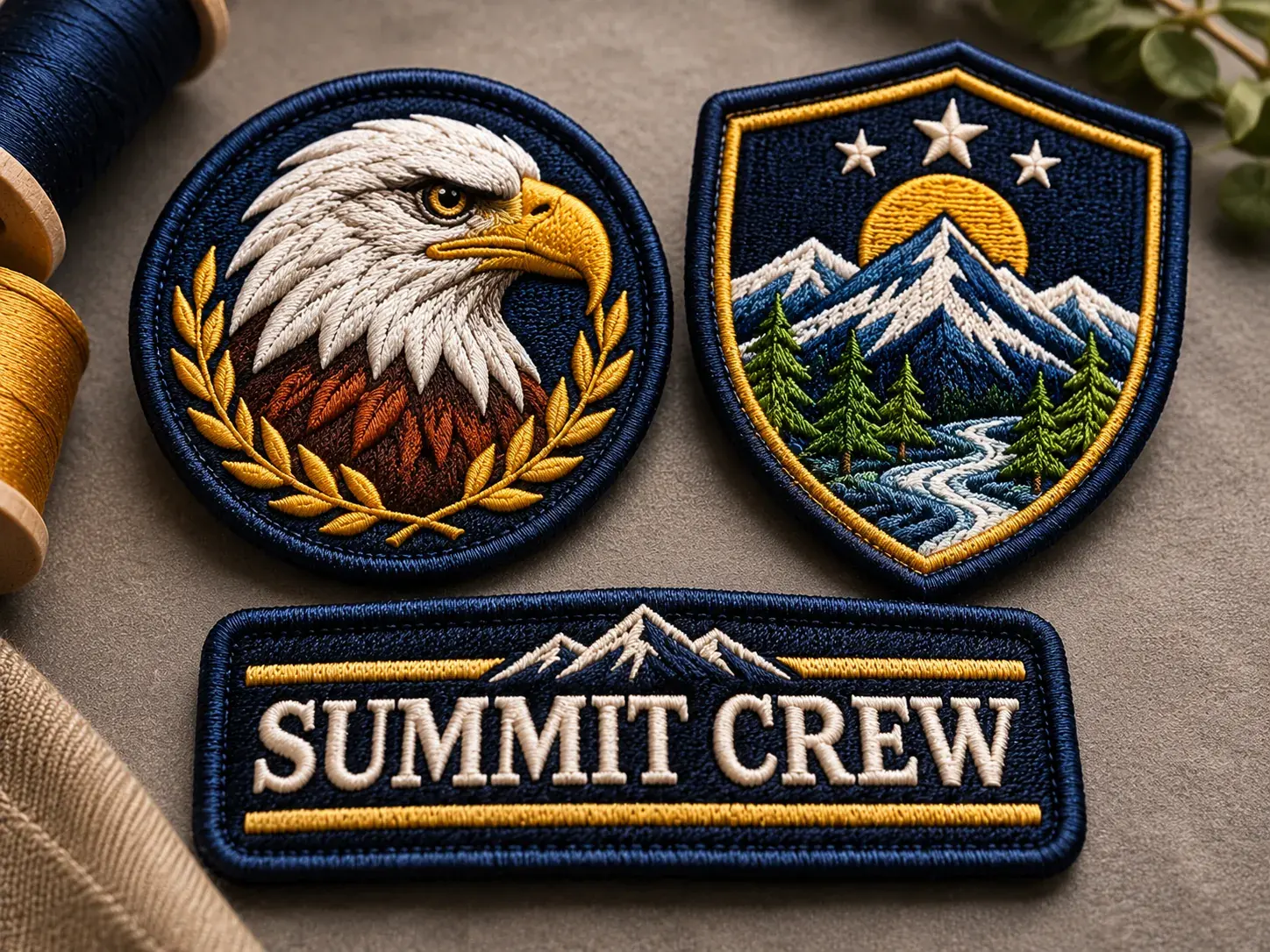
For example, a fire company shoulder patch needs a bold name and a clear emblem. A brand's hat patch, on the other hand, might be just a logo mark. Also, the patch type changes what's possible. Our guide to types of patches compares styles side by side.
Patch Ideas to Get You Started
Stuck on a concept? These patch ideas work well because they rely on simple, recognizable shapes.
- Team or club mascot with the name in a curved banner below.
- Outdoor badge with mountains, pine trees or waves inside a circle.
- Company logo patch for uniforms, merch or client gifts.
- Event patch with the event name, year and one bold icon.
- Crew or unit emblem in a shield with a motto on a ribbon.
- Morale patch with a short, funny phrase and a simple character.
- Name tape for workwear or tactical gear.
Patch Design Rules for Clean Results
Use bold shapes
Thread, rubber and loop yarn can't reproduce hairline detail. So, build the design from solid shapes with clear edges. If a detail disappears when you shrink the design to thumbnail size, remove it.
Limit your colors
Fewer colors make a cleaner patch. Most strong designs use about three to seven colors, including the background and border. Gradients don't stitch well, so swap them for two or three flat tones.
Keep text large enough
As a rule of thumb, keep embroidered text at least a quarter inch tall. Woven patches can go smaller. Also, choose bold sans-serif fonts, because thin scripts and serifs break up in thread.
Add outlines
A dark outline around key shapes and letters helps them stand out. It also hides small shifts in stitching. Then, finish the patch with a border color that frames the whole design.
Plan for contrast
Light text on a dark background, or the reverse, reads best from a distance. Similar tones, like navy on black, blend together. Likewise, consider the garment color, since the border meets it directly.
Leave breathing room
Crowded patches look busy and lose detail. Leave space between elements and around the edge. As a result, the border won't cut into your letters.
Embroidery Patch Designs vs PVC and Woven Designs
Each patch type has its own strengths. Use this table to match your design to the right style.
| Design element | Embroidered | Woven | PVC |
|---|---|---|---|
| Small text | Fair (keep it about 1/4 in or larger) | Excellent | Good |
| Thin lines | Fair | Excellent | Good |
| Gradients | Not recommended | Limited | Not recommended |
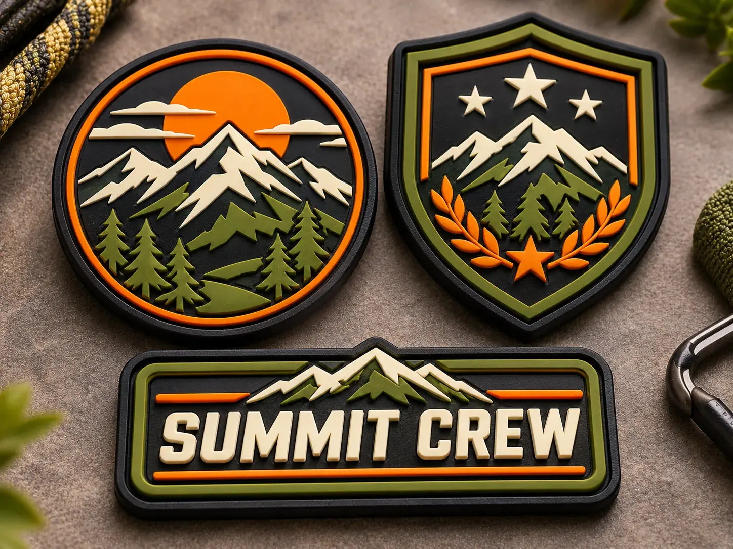
| Raised texture | Yes, with 3D puff | No, flat finish | Yes, with 3D molds |
| Best design style | Bold, classic badges | Detailed logos and labels | Graphic, cartoon or tactical art |
If your artwork is bold and classic, custom embroidered patches are a natural fit. If it has raised, cartoon-like shapes, consider PVC patches instead.
Hat Patch Design Tips
Hat patch design has extra limits, because the space is small and curved. Wide, short layouts usually look best on caps. Similarly, a single icon or short word reads better than a full logo with a tagline.
- Keep the main element centered and bold.
- Drop small taglines, or move them to the side or back of the hat.
- Pick rectangles, ovals or rounded badges that follow the crown.
- Try woven or leather for a clean, low-profile look.
Our patch size and shape guide lists typical hat patch dimensions.
Patch Artwork: File Types to Send
The cleaner your file, the more accurate your proof. Here's what to send, from best to acceptable.
| File type | Examples | Notes |
|---|---|---|
| Vector (best) | AI, EPS, SVG, vector PDF | Scales to any size without blur |
| High-resolution image | PNG or JPG at about 300 dpi | Fine for most patches |
| Sketch or photo | Phone photo, scan, drawing | Our team can redraw it for production |
Common Mistakes That Weaken a Patch
Most problems we see in artwork are easy to fix early. However, they're hard to fix once a proof is ready. Watch for these before you send your file.
- Too much text. A slogan, a website and a phone number won't fit on a 3 inch patch. Keep only the words that matter.
- Tiny details inside small shapes. Facial features, fine hatching and thin stripes often blur into one color.
- Low contrast. Dark green on black or light gray on white disappears from a few feet away.
- Thin, delicate fonts. Script and light serif fonts break apart in thread. Bold letters hold up much better.
- Designing at the wrong size. A full-page design shrunk down later loses detail. Instead, sketch at actual patch size from the start.
- Ignoring the garment. A navy border on a navy jacket vanishes. Pick a border that contrasts with what the patch sits on.
Fixing these issues first saves rounds of changes later. In addition, it gives you a cleaner proof the first time.
Test Your Artwork at Actual Size
- 01
Print at 100% scale
Print the design at the exact size of the patch, not larger.
- 02
Check it from a distance
Pin it to the garment and step back about six feet. Can you read the main text?
- 03
Do a grayscale test
Print it in black and white. If shapes blend together, add contrast or outlines.
- 04
Measure the smallest text
Use a ruler. If letters are under a quarter inch for embroidery, enlarge or simplify them.
From Finished Artwork to Digital Proof
Once your design is ready, send it with the size, quantity and backing you want. Our team reviews it and replies with a quote and any suggested tweaks. Next, you approve a digital proof before production starts.
Ready to see your idea as a patch? Upload your artwork for a quote and ask our team about quantities and timing.
Frequently Asked Questions
Do I need a designer to make a patch?
No. A clear sketch or a basic logo file is enough to start. Our team reviews your artwork and suggests changes, such as larger text or fewer colors, before you approve a proof.
What file format is best for patch design?
Vector files like AI, EPS, SVG or vector PDF work best because they scale cleanly. A high-resolution PNG or JPG is fine too. A sketch or photo can also work as a starting point.
How many colors should a patch have?
Most clean patch designs use about three to seven colors, counting the background and border. Fewer colors usually mean sharper results and better contrast.
Can a patch design include gradients or photos?
Not with thread or PVC, because both use solid color areas. If you need gradients or photo detail, ask about printed or sublimated patches, which print the image onto fabric.